AppLovin Resource Center
Web Design
UI Design
UI/UX
Taxonomy
Design Systems
Content Platform
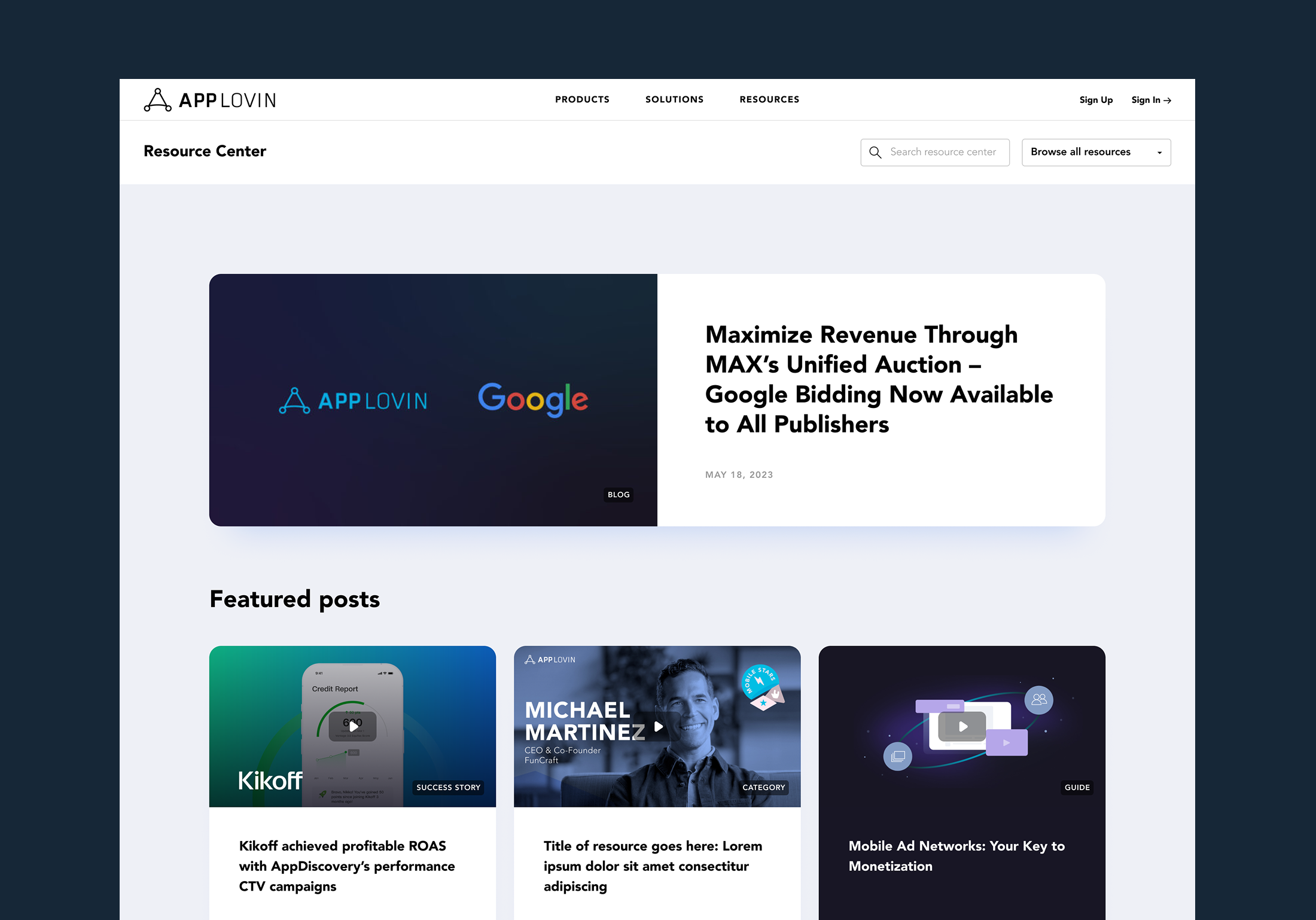
Overview
I led the redesign of AppLovin’s proprietary Resource Center — a scalable content platform built to educate developers and partners across AppLovin’s products, solutions, and the broader advertising ecosystem. The goal was to transform a dated system into a structured, modern resource hub that made a complex library of content easy to browse, search, and discover.
Role:
Lead Web & UI Designer
Scope
Information architecture, taxonomy, UX patterns, UI design, and component system across major templates
Date:
Lead Web Designer/Marketing Designer
*Below is a condensed summary of the project. For full details and strategic thinking, please scroll below past the project visuals.
The Problem
- The existing taxonomy was outdated and inconsistent, creating confusion and manual maintenance
- Categories and tags overlapped, making content hard to manage and harder for users to find
- Users had different browsing needs (by product, topic, or content type), but the experience supported none of them well
Solution
- Rebuilt the information architecture and simplified ~30+ categories into a clearer set of topic pillars
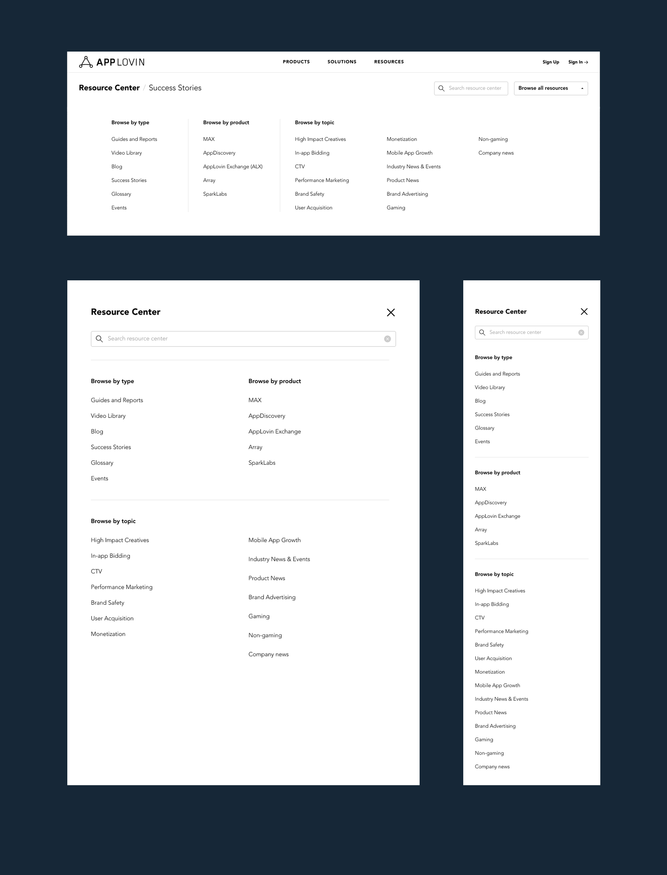
- Designed a 3-part navigation model so users could browse by content type, product, or topic
- Added discovery-driven modules like Browse by Business Objective to guide users who weren’t sure where to start
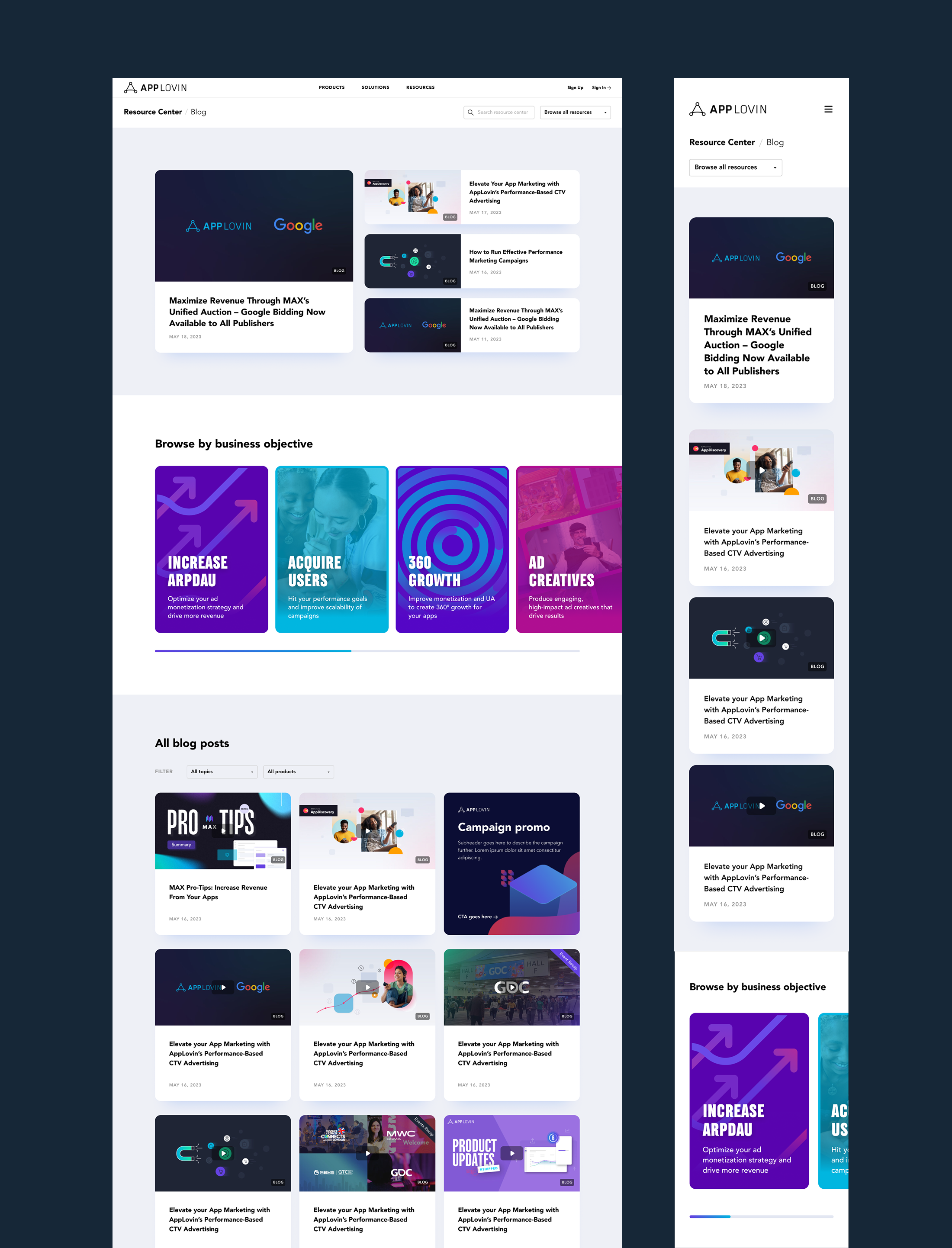
Blog Page
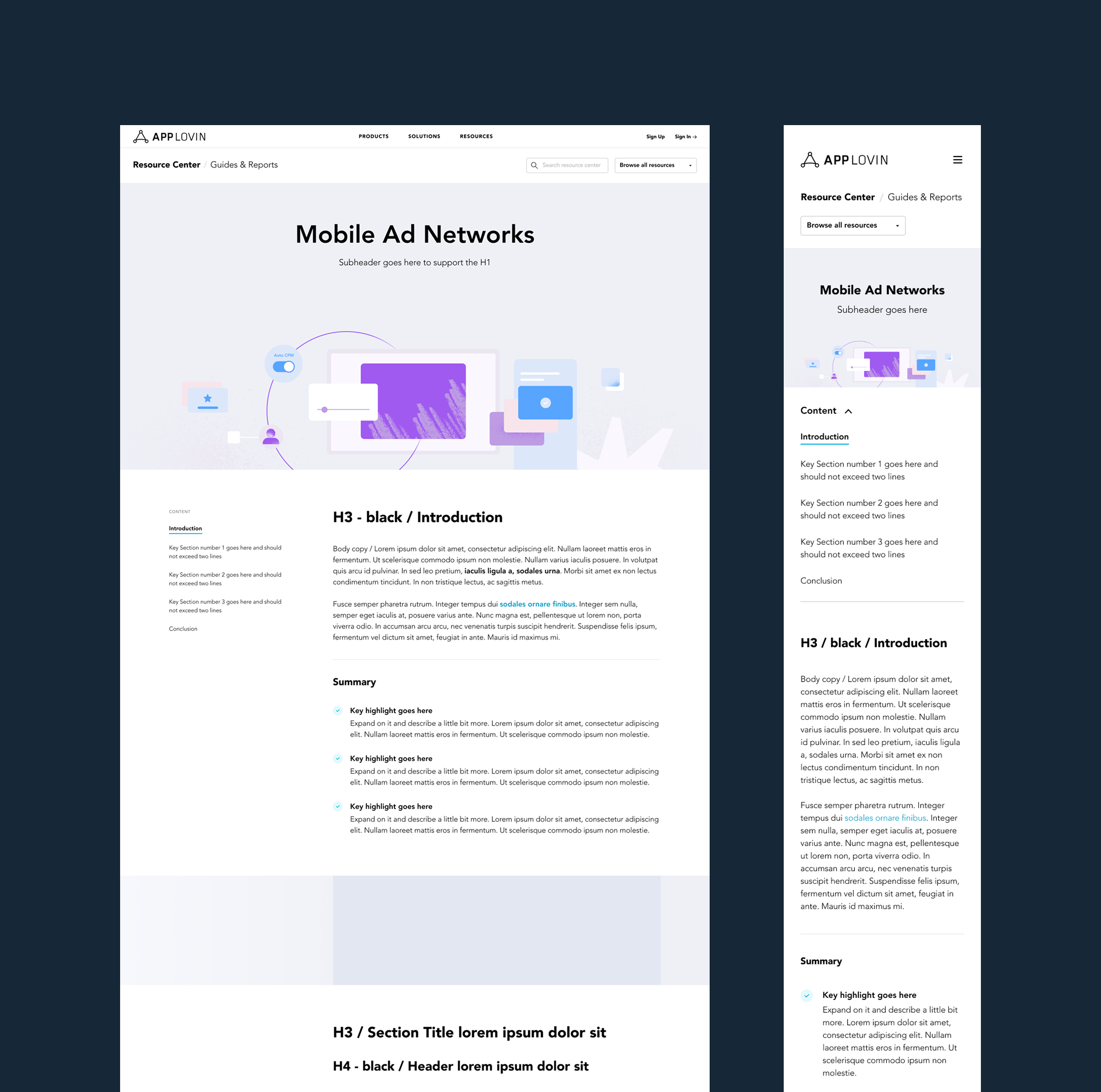
Guides & Reports Master
Solution
1) A new taxonomy designed to scale
Working closely with the content team, we distilled ~30 inconsistent categories down to 15 clear topic areas that covered the full range of content AppLovin developers and partners might look for.
2) A 3-part navigation model
We designed a navigation system that supported multiple mental models depending on what the user already knew. Users could browse by:
- Content type (Guides & Reports, Video Library, Blog, Success Stories, Glossary, Events)
- Product (MAX, AppDiscovery, AppLovin Exchange, Array, SparkLabs)
- Topic (e.g. In-app Bidding, CTV, Monetization, UA, Brand Safety, etc.)
This structure supported both targeted browsing (“I’m here for MAX”) and exploratory learning (“I want to understand monetization”).
3) Discovery-driven UX for unclear intent
To support users who weren’t sure where to start, we introduced Browse by Business Objective — a reusable module that could live across the platform and guide users into relevant content pathways.
Objectives included:
- Acquire Users
- Increase ARPDAU
- 360 Growth
- Ad Creatives
- Premium Supply
- Protect Users (Brand Safety)
- Activate CTV
This structure supported both targeted browsing (“I’m here for MAX”) and exploratory learning (“I want to understand monetization”).
Pages & Templates
This redesign covered a wide set of templates across the platform, including:
Core overview pages
- Resource Center Homepage
- Blog
- Video Library
- Guides & Reports
- Success Stories
- Events & Webinars
- Author Page
Result & discovery pages
- Search Results
- Topic Page
- Product Page
- Objective Page
This structure supported both targeted browsing (“I’m here for MAX”) and exploratory learning (“I want to understand monetization”).
Individual content pages
- Article (Blog)
- Guide / Report
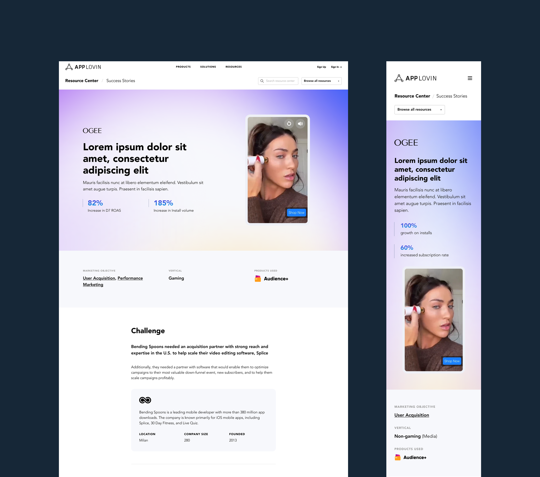
- Success Story
Outcome
The new Resource Center became a scalable, component-driven platform that improved clarity for users and reduced friction for publishing and maintenance. It created a consistent structure across content types while making it easier for developers to explore topics, products, and objectives through a guided discovery experience.
Key Challenges
- The taxonomy was outdated and inconsistent, creating confusion and manual work
- Categories and tags weren’t clearly defined, which made content harder to maintain and harder to find
- The platform needed to serve multiple audiences, primarily developers ranging from new to advanced
- Navigation and filtering didn’t support discovery for users who didn’t know what to search for
© 2026 Designed by JP Brown
AppLovin Resource Center
Web Design
UI Design
UI/UX
Taxonomy
Design Systems
Content Platform

Overview
I led the redesign of AppLovin’s proprietary Resource Center — a scalable content platform built to educate developers and partners across AppLovin’s products, solutions, and the broader advertising ecosystem. The goal was to transform a dated system into a structured, modern resource hub that made a complex library of content easy to browse, search, and discover.
Role:
Lead Web & UI Designer
Scope
Information architecture, taxonomy, UX patterns, UI design, and component system across major templates
Date:
Lead Web Designer/Marketing Designer
*Below is a condensed summary of the project. For full details and strategic thinking, please scroll below past the project visuals.
The Problem
- The existing taxonomy was outdated and inconsistent, creating confusion and manual maintenance
- Categories and tags overlapped, making content hard to manage and harder for users to find
- Users had different browsing needs (by product, topic, or content type), but the experience supported none of them well
Solution
- Rebuilt the information architecture and simplified ~30+ categories into a clearer set of topic pillars
- Designed a 3-part navigation model so users could browse by content type, product, or topic
- Added discovery-driven modules like Browse by Business Objective to guide users who weren’t sure where to start
Blog Page

Guides & Reports Master

Case Studies

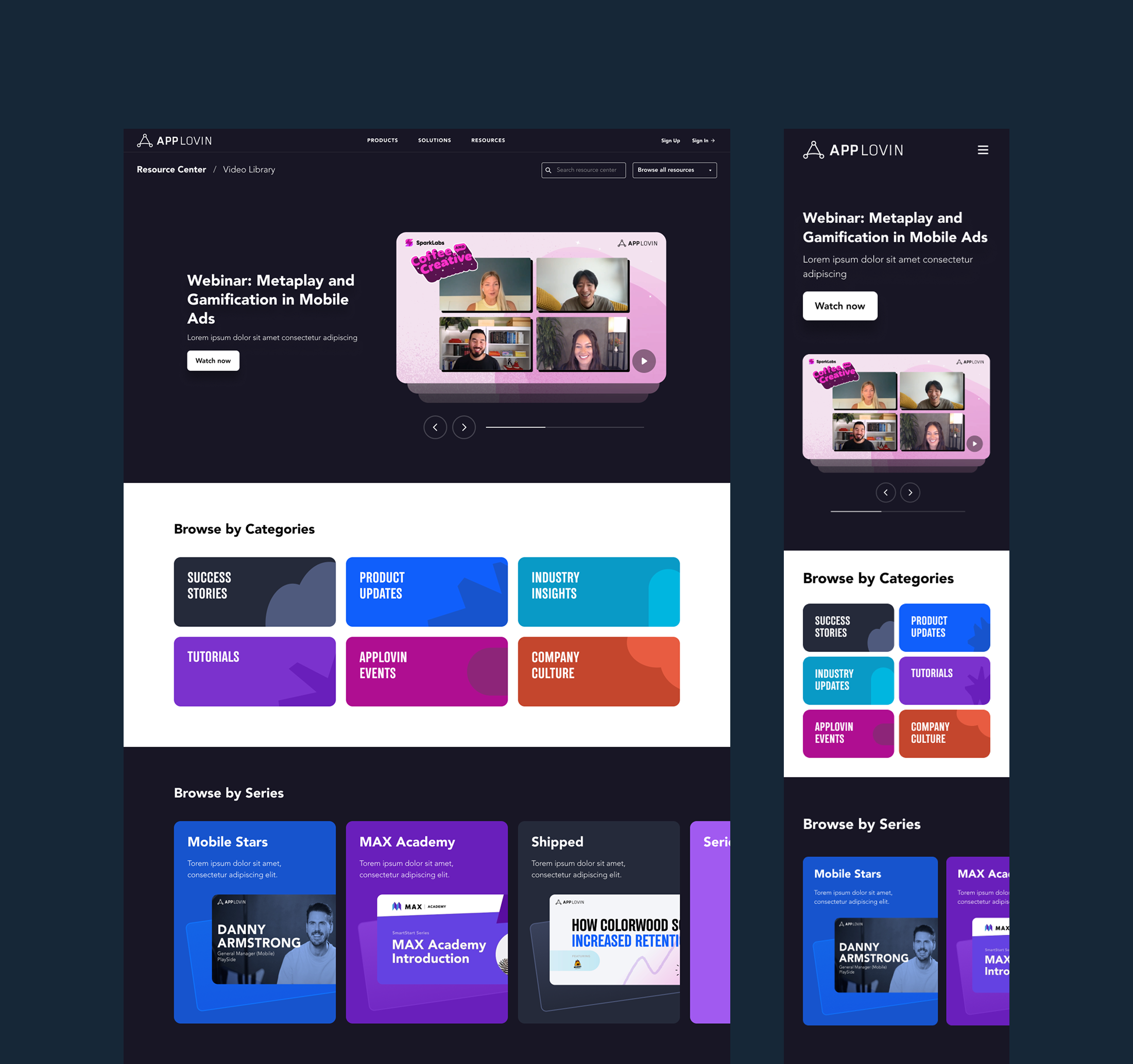
Video Library

Navigation

Key Challenges
- The taxonomy was outdated and inconsistent, creating confusion and manual work
- Categories and tags weren’t clearly defined, which made content harder to maintain and harder to find
- The platform needed to serve multiple audiences, primarily developers ranging from new to advanced
- Navigation and filtering didn’t support discovery for users who didn’t know what to search for
Solution
1) A new taxonomy designed to scale
Working closely with the content team, we distilled ~30 inconsistent categories down to 15 clear topic areas that covered the full range of content AppLovin developers and partners might look for.
2) A 3-part navigation model
We designed a navigation system that supported multiple mental models depending on what the user already knew. Users could browse by:
- Content type (Guides & Reports, Video Library, Blog, Success Stories, Glossary, Events)
- Product (MAX, AppDiscovery, AppLovin Exchange, Array, SparkLabs)
- Topic (e.g. In-app Bidding, CTV, Monetization, UA, Brand Safety, etc.)
This structure supported both targeted browsing (“I’m here for MAX”) and exploratory learning (“I want to understand monetization”).
3) Discovery-driven UX for unclear intent
To support users who weren’t sure where to start, we introduced Browse by Business Objective — a reusable module that could live across the platform and guide users into relevant content pathways.
Objectives included:
- Acquire Users
- Increase ARPDAU
- 360 Growth
- Ad Creatives
- Premium Supply
- Protect Users (Brand Safety)
- Activate CTV
This structure supported both targeted browsing (“I’m here for MAX”) and exploratory learning (“I want to understand monetization”).
Pages & Templates
This redesign covered a wide set of templates across the platform, including:
Core overview pages
- Resource Center Homepage
- Blog
- Video Library
- Guides & Reports
- Success Stories
- Events & Webinars
- Author Page
Result & discovery pages
- Search Results
- Topic Page
- Product Page
- Objective Page
This structure supported both targeted browsing (“I’m here for MAX”) and exploratory learning (“I want to understand monetization”).
Individual content pages
- Article (Blog)
- Guide / Report
- Success Story
Outcome
The new Resource Center became a scalable, component-driven platform that improved clarity for users and reduced friction for publishing and maintenance. It created a consistent structure across content types while making it easier for developers to explore topics, products, and objectives through a guided discovery experience.
© 2026 Designed by JP Brown
AppLovin Resource Center
Web Design
UI Design
UI/UX
Taxonomy
Design Systems
Content Platform

Overview
I led the redesign of AppLovin’s proprietary Resource Center — a scalable content platform built to educate developers and partners across AppLovin’s products, solutions, and the broader advertising ecosystem. The goal was to transform a dated system into a structured, modern resource hub that made a complex library of content easy to browse, search, and discover.
Role:
Lead Web & UI Designer
Scope
Information architecture, taxonomy, UX patterns, UI design, and component system across major templates
Date:
Lead Web Designer/Marketing Designer
*Below is a condensed summary of the project. For full details and strategic thinking, please scroll below past the project visuals.
The Problem
- The existing taxonomy was outdated and inconsistent, creating confusion and manual maintenance
- Categories and tags overlapped, making content hard to manage and harder for users to find
- Users had different browsing needs (by product, topic, or content type), but the experience supported none of them well
Solution
- Rebuilt the information architecture and simplified ~30+ categories into a clearer set of topic pillars
- Designed a 3-part navigation model so users could browse by content type, product, or topic
- Added discovery-driven modules like Browse by Business Objective to guide users who weren’t sure where to start
Blog Page

Guides & Reports Master

Case Studies

Video Library

Navigation

Key Challenges
- The taxonomy was outdated and inconsistent, creating confusion and manual work
- Categories and tags weren’t clearly defined, which made content harder to maintain and harder to find
- The platform needed to serve multiple audiences, primarily developers ranging from new to advanced
- Navigation and filtering didn’t support discovery for users who didn’t know what to search for
Solution
1) A new taxonomy designed to scale
Working closely with the content team, we distilled ~30 inconsistent categories down to 15 clear topic areas that covered the full range of content AppLovin developers and partners might look for.
2) A 3-part navigation model
We designed a navigation system that supported multiple mental models depending on what the user already knew. Users could browse by:
- Content type (Guides & Reports, Video Library, Blog, Success Stories, Glossary, Events)
- Product (MAX, AppDiscovery, AppLovin Exchange, Array, SparkLabs)
- Topic (e.g. In-app Bidding, CTV, Monetization, UA, Brand Safety, etc.)
This structure supported both targeted browsing (“I’m here for MAX”) and exploratory learning (“I want to understand monetization”).
3) Discovery-driven UX for unclear intent
To support users who weren’t sure where to start, we introduced Browse by Business Objective — a reusable module that could live across the platform and guide users into relevant content pathways.
Objectives included:
- Acquire Users
- Increase ARPDAU
- 360 Growth
- Ad Creatives
- Premium Supply
- Protect Users (Brand Safety)
- Activate CTV
This structure supported both targeted browsing (“I’m here for MAX”) and exploratory learning (“I want to understand monetization”).
Pages & Templates
This redesign covered a wide set of templates across the platform, including:
Core overview pages
- Resource Center Homepage
- Blog
- Video Library
- Guides & Reports
- Success Stories
- Events & Webinars
- Author Page
Result & discovery pages
- Search Results
- Topic Page
- Product Page
- Objective Page
This structure supported both targeted browsing (“I’m here for MAX”) and exploratory learning (“I want to understand monetization”).
Individual content pages
- Article (Blog)
- Guide / Report
- Success Story
Outcome
The new Resource Center became a scalable, component-driven platform that improved clarity for users and reduced friction for publishing and maintenance. It created a consistent structure across content types while making it easier for developers to explore topics, products, and objectives through a guided discovery experience.
© 2026 Designed by JP Brown
AppLovin Resource Center
Web Design
UI Design
UI/UX
Taxonomy
Design Systems
Content Platform

Overview
I led the redesign of AppLovin’s proprietary Resource Center — a scalable content platform built to educate developers and partners across AppLovin’s products, solutions, and the broader advertising ecosystem. The goal was to transform a dated system into a structured, modern resource hub that made a complex library of content easy to browse, search, and discover.
Role:
Lead Web & UI Designer
Scope
Information architecture, taxonomy, UX patterns, UI design, and component system across major templates
Date:
Lead Web Designer/Marketing Designer
*Below is a condensed summary of the project. For full details and strategic thinking, please scroll below past the project visuals.
The Problem
- The existing taxonomy was outdated and inconsistent, creating confusion and manual maintenance
- Categories and tags overlapped, making content hard to manage and harder for users to find
- Users had different browsing needs (by product, topic, or content type), but the experience supported none of them well
Solution
- Rebuilt the information architecture and simplified ~30+ categories into a clearer set of topic pillars
- Designed a 3-part navigation model so users could browse by content type, product, or topic
- Added discovery-driven modules like Browse by Business Objective to guide users who weren’t sure where to start
Blog Page

Guides & Reports Master

Case Studies

Video Library

Navigation

Key Challenges
- The taxonomy was outdated and inconsistent, creating confusion and manual work
- Categories and tags weren’t clearly defined, which made content harder to maintain and harder to find
- The platform needed to serve multiple audiences, primarily developers ranging from new to advanced
- Navigation and filtering didn’t support discovery for users who didn’t know what to search for
Solution
1) A new taxonomy designed to scale
Working closely with the content team, we distilled ~30 inconsistent categories down to 15 clear topic areas that covered the full range of content AppLovin developers and partners might look for.
2) A 3-part navigation model
We designed a navigation system that supported multiple mental models depending on what the user already knew. Users could browse by:
- Content type (Guides & Reports, Video Library, Blog, Success Stories, Glossary, Events)
- Product (MAX, AppDiscovery, AppLovin Exchange, Array, SparkLabs)
- Topic (e.g. In-app Bidding, CTV, Monetization, UA, Brand Safety, etc.)
This structure supported both targeted browsing (“I’m here for MAX”) and exploratory learning (“I want to understand monetization”).
3) Discovery-driven UX for unclear intent
To support users who weren’t sure where to start, we introduced Browse by Business Objective — a reusable module that could live across the platform and guide users into relevant content pathways.
Objectives included:
- Acquire Users
- Increase ARPDAU
- 360 Growth
- Ad Creatives
- Premium Supply
- Protect Users (Brand Safety)
- Activate CTV
This structure supported both targeted browsing (“I’m here for MAX”) and exploratory learning (“I want to understand monetization”).
Pages & Templates
This redesign covered a wide set of templates across the platform, including:
Core overview pages
- Resource Center Homepage
- Blog
- Video Library
- Guides & Reports
- Success Stories
- Events & Webinars
- Author Page
Result & discovery pages
- Search Results
- Topic Page
- Product Page
- Objective Page
This structure supported both targeted browsing (“I’m here for MAX”) and exploratory learning (“I want to understand monetization”).
Individual content pages
- Article (Blog)
- Guide / Report
- Success Story
Outcome
The new Resource Center became a scalable, component-driven platform that improved clarity for users and reduced friction for publishing and maintenance. It created a consistent structure across content types while making it easier for developers to explore topics, products, and objectives through a guided discovery experience.
© 2026 Designed by JP Brown
AppLovin Resource Center
Web Design
UI Design
UI/UX
Taxonomy
Design Systems
Content Platform

Overview
I led the redesign of AppLovin’s proprietary Resource Center — a scalable content platform built to educate developers and partners across AppLovin’s products, solutions, and the broader advertising ecosystem. The goal was to transform a dated system into a structured, modern resource hub that made a complex library of content easy to browse, search, and discover.
Role:
Lead Web & UI Designer
Scope
Information architecture, taxonomy, UX patterns, UI design, and component system across major templates
Date:
Summer 2025
*Below is a condensed summary of the project. For full details and strategic thinking, please scroll below past the project visuals.
The Problem
- The existing taxonomy was outdated and inconsistent, creating confusion and manual maintenance
- Categories and tags overlapped, making content hard to manage and harder for users to find
- Users had different browsing needs (by product, topic, or content type), but the experience supported none of them well
Solution
- Rebuilt the information architecture and simplified ~30+ categories into a clearer set of topic pillars
- Designed a 3-part navigation model so users could browse by content type, product, or topic
- Added discovery-driven modules like Browse by Business Objective to guide users who weren’t sure where to start
Blog Page

Guides & Reports Master

Case Studies

Video Library

Navigation

Key Challenges
- The taxonomy was outdated and inconsistent, creating confusion and manual work
- Categories and tags weren’t clearly defined, which made content harder to maintain and harder to find
- The platform needed to serve multiple audiences, primarily developers ranging from new to advanced
- Navigation and filtering didn’t support discovery for users who didn’t know what to search for
Solution
1) A new taxonomy designed to scale
Working closely with the content team, we distilled ~30 inconsistent categories down to 15 clear topic areas that covered the full range of content AppLovin developers and partners might look for.
2) A 3-part navigation model
We designed a navigation system that supported multiple mental models depending on what the user already knew. Users could browse by:
- Content type (Guides & Reports, Video Library, Blog, Success Stories, Glossary, Events)
- Product (MAX, AppDiscovery, AppLovin Exchange, Array, SparkLabs)
- Topic (e.g. In-app Bidding, CTV, Monetization, UA, Brand Safety, etc.)
This structure supported both targeted browsing (“I’m here for MAX”) and exploratory learning (“I want to understand monetization”).
3) Discovery-driven UX for unclear intent
To support users who weren’t sure where to start, we introduced Browse by Business Objective — a reusable module that could live across the platform and guide users into relevant content pathways.
Objectives included:
- Acquire Users
- Increase ARPDAU
- 360 Growth
- Ad Creatives
- Premium Supply
- Protect Users (Brand Safety)
- Activate CTV
This structure supported both targeted browsing (“I’m here for MAX”) and exploratory learning (“I want to understand monetization”).
Pages & Templates
This redesign covered a wide set of templates across the platform, including:
Core overview pages
- Resource Center Homepage
- Blog
- Video Library
- Guides & Reports
- Success Stories
- Events & Webinars
- Author Page
Result & discovery pages
- Search Results
- Topic Page
- Product Page
- Objective Page
This structure supported both targeted browsing (“I’m here for MAX”) and exploratory learning (“I want to understand monetization”).
Individual content pages
- Article (Blog)
- Guide / Report
- Success Story
Outcome
The new Resource Center became a scalable, component-driven platform that improved clarity for users and reduced friction for publishing and maintenance. It created a consistent structure across content types while making it easier for developers to explore topics, products, and objectives through a guided discovery experience.
© 2026 Designed by JP Brown
